We at True Sparrow had our first work week at Pune a couple of months back, many of us meeting and getting to know each other for the first time, getting to know our team.
We realised that our team is much more than our products; we are people-centric, and our existing website couldn't quite bridge the gap between what we are as a team, the products we make and how we wanted the world to see us. We identified a need to update it, bringing them in line with the evolution of our visual language.

Deciding Our New Theme

As we explored how we could make our website more in sync with the diverse backgrounds and cultural goals as a team, the theme that felt in sync with what we are as a company led us to Brutalism. We wanted to use colours and eccentric styles to play around with.
This time, we wanted to design our design system just like we'd design our product experiences. We weren't starting with a completely blank slate, though. We wanted to consolidate and rework our website and create a system that felt unified, accessible, collaborative, and based on a coherent vision.
We kicked off with a series of ideation workshops during our work week. The re-design was an opportunity to create a joyful pedestal to showcase our designers' and developers' best work.
We rated the resulting ideas on a mega matrix of newness, usefulness, feasibility, playfulness, and brand relevance. We wanted to make small yet incremental changes to the design language so that the direction we take would be more Neo-Brutalist. Here are some of the site elements that came out of the mega matrix and made it into the final designs:
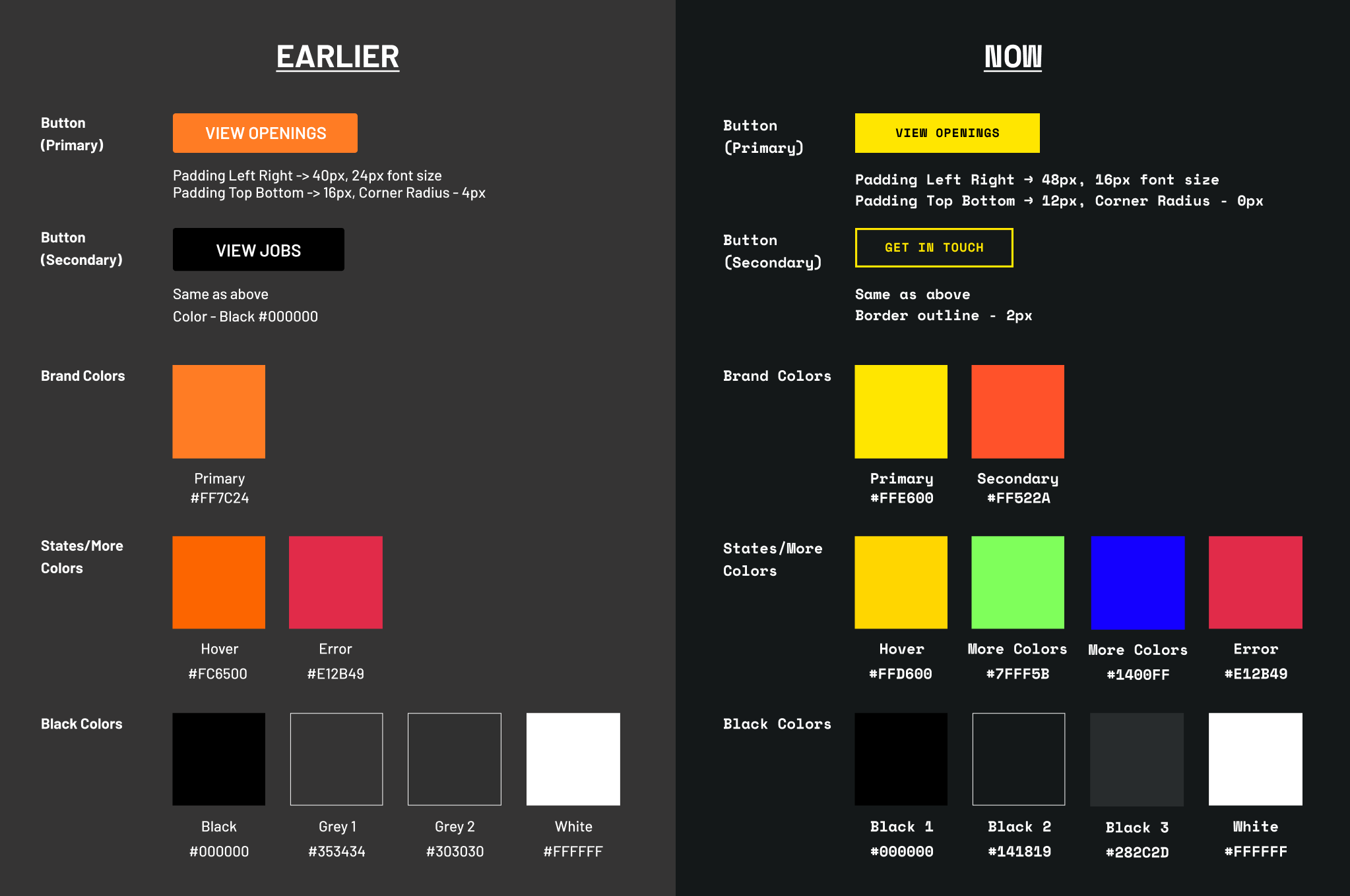
Refreshed CTA's and Colours
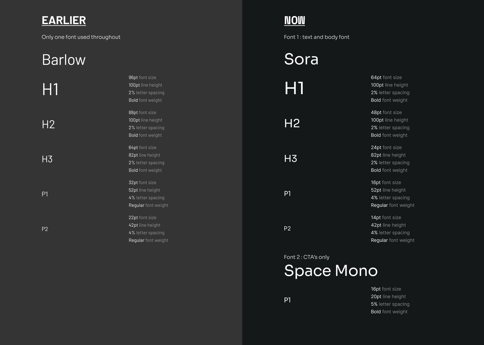
Brutalism is all about crude and raw edges and colours with high contrast. Not to mention the fonts - using Space Mono for CTA's gave a unique edge to the personality of our website than playing it safe with Barlow earlier. Also, using two different fonts now - Space Mono for CTA's only and Sora for the headers, paragraphs, and the web page, in general, gave a new edgier look to the website in the most subtle way.

Using Brutalism as a theme opened our doors to having fun with many colours! Having the primary colour as a high contrast yellow on the dark background stood out well and bought out the essence of the theme. As you can see below, we did NOT shy away from colours, keeping the primary and secondary colours as yellow and orange, respectively; some highlight colours like green and blue in the form of small animated elements & backgrounds added the surprise element to the website.

A new About Us page
To explain how the team works, our values and culture, and snippets about each of us. Starting from the fonts, colours, CTA's and overall styling glowed up!

Carousel showcasing Our Projects
Share our previous award-winning projects and open-source products that other organisations can dive into.

Animation of elements
To emphasise essential sections of our website and showcase our design and developer talent✨
Job Openings and Careers Page
We wanted to make small yet incremental changes to the design language so that the direction we take would be more Neo-Brutalist.

This project was super exciting; we got to explore and bring our creativity to the maximum. And, of course, this project wouldn't have been possible without our Design Team at True Sparrow.


