In our previous article in this series, we discussed a few basic components of Jetpack Compose. In this article, we will go ahead with some more components in Jetpack Compose.
Image:
A component that renders drawables and images from an URL. The modifier prop accepts different types of functions. For example, the size method is used to change the dimensions of the image. Similarly, a clip function is used to change the shape of the image.
Image(
   painter = painterResource(id = R.drawable.branding_image),
   contentDescription = "Logo",
   Modifier
       .size(40.dp)
       .clip(
           CircleShape
       )
)

TextField:
A component that accepts text as input from the user. The onValueChange callback function provides an iterator it with the current text in the TextField.
var text = remember {
	mutableStateOf("Text")
    }
TextField(
    value = text.value,
    onValueChange = {
	    text.value = it
    }
)
Icon:
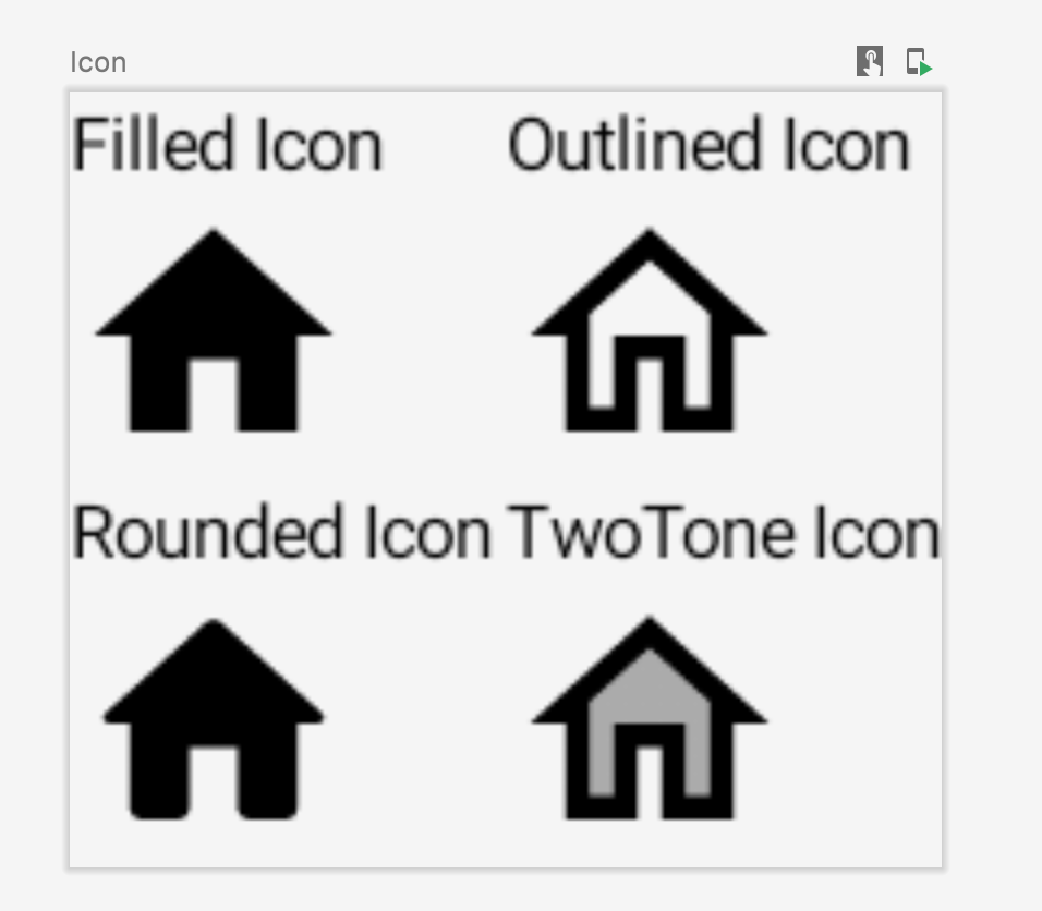
A component to render Icons. We can get a bunch of icons from androidx.compose.material.icons library. Icons belong to 4 different categories namely Filled, Outlined, Rounded, and TwoTone.
Column() {
        Row() {
            Column() {
            Text(text = "Filled Icon", fontSize = 6.sp)
            Icon(
                painter = rememberVectorPainter(Icons.Filled.Home),
                contentDescription = "Home Filled Icon"
            )
            }
            Column() {
                Text(text = "Outlined Icon", fontSize = 6.sp)
                Icon(
                    painter = rememberVectorPainter(Icons.Outlined.Home),
                    contentDescription = "Home Outlined Icon"
                )
            }
        }

        Row() {
            Column() {
                Text(text = "Rounded Icon", fontSize = 6.sp)
                Icon(
                    painter = rememberVectorPainter(Icons.Rounded.Home),
                    contentDescription = "Home Round Icon"
                )
            }
            Column() {
                Text(text ="TwoTone Icon", fontSize = 6.sp)
                Icon(
                    painter = rememberVectorPainter(Icons.TwoTone.Home),
                    contentDescription = "Home TwoTone Icon"
                )
            }
        }

}
Conclusion:
In this article, we have discussed some of the commonly used components required to build a user interface in Android applications. We will be discussing more components and layouts in Jetpack Compose in upcoming blogs.
Stay tuned for more updates.


